Colour Me Productive – How Paint Affects Office Productivity

Have you ever felt annoyed because a colour in a room is overwhelming or too bright? And think for a moment about your favourite colour. Why do you like it so much? Does it make you feel something? Or perhaps it represents something personal to you – like a favourite place or a memory.
Colour has meaning. Throughout history, societies have associated certain things with certain colours – like blue for royalty (or royal blue); red for intense emotions like love; or green for the environment.
But it’s not just the symbolic connotations of colour that affect us. Studies have shown that colours physically affect our state of mind. And in an office space, this links directly to productivity.
Colour Psychology
Red: Red isn’t for everyone. And it isn’t always the ideal colour for an office. But it has been shown to work really well in gyms, sports arenas and other areas where there’s physical activity.
Red is the colour of passion, and that’s exactly how it behaves. Red stands out and says, “Hey! Look at me!” and it gets the blood flowing and excitement levels up. So, whether or not you use this colour in your work environment should really depend on what kind of workplace it is.
Yellow: Yellow has a different kind of vibrance to red. It’s said to be effective in creative spaces because it invokes artistic and creative energy. It’s a “happy” colour. In fact, you’ll find that it’s widely used in a lot of products and media aimed at children – think LEGO, Spongebob Squarepants, Sesame Street and many more.
Yellow is a “fun colour”, but don’t use it in an office space with too much reckless abandon. Too much of a good thing can be tiring. And if your company is more traditionally corporate, it may not be quite the right fit for your staff.
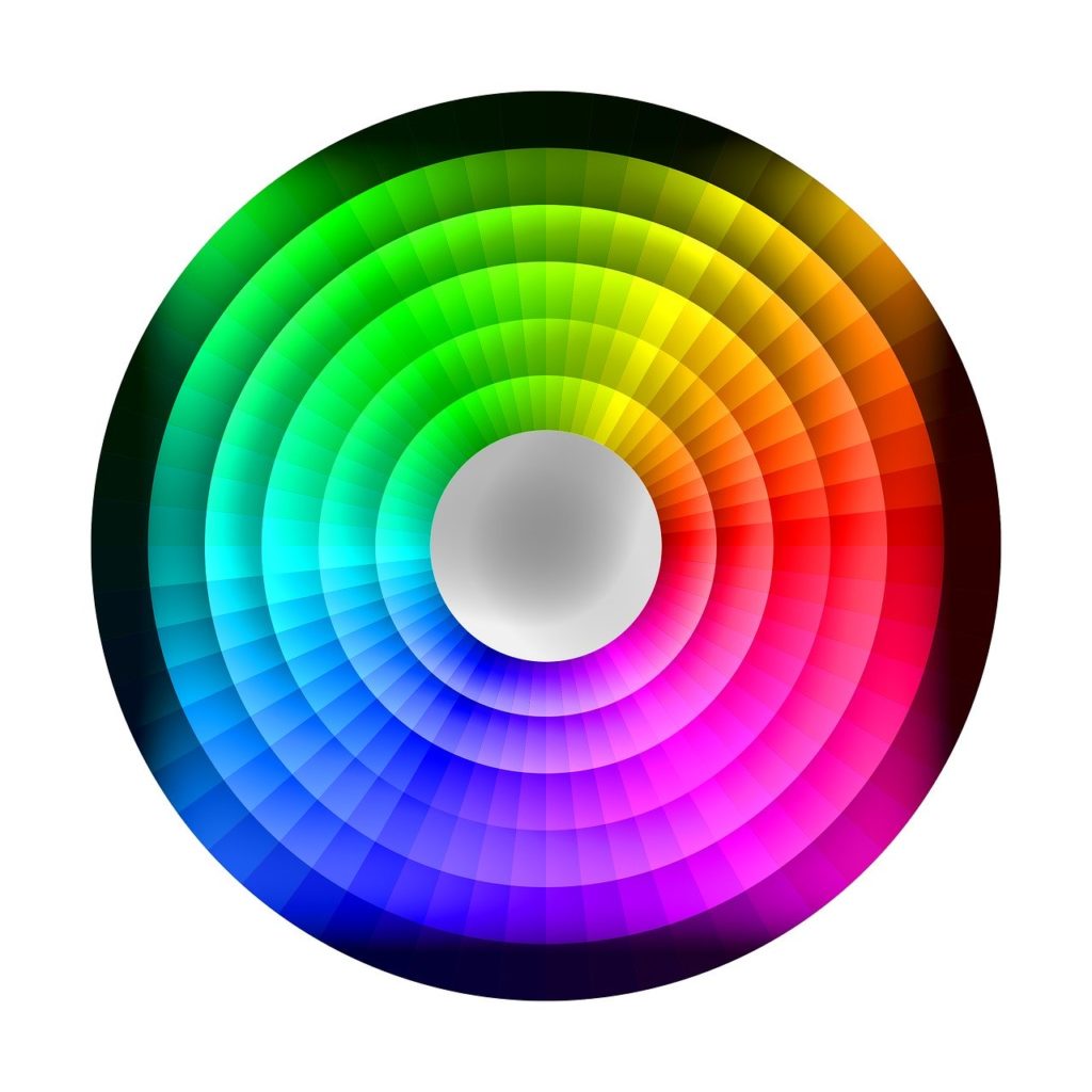
Blue: Blue is more neutral than any of the other colours on this list. It has a calming effect that is conducive to better focus and a more stable working environment. You don’t have to go all blue, though. It’s a colour that works really well when complemented by other colours. Take a look at the colour wheel for a few ideas.
Green: Studies show that green is a colour that works well on longer days. It has a calming effect and is less likely to cause tired eyes than brighter colours. Less fatigue means better concentration, so green is potentially a very productive colour.
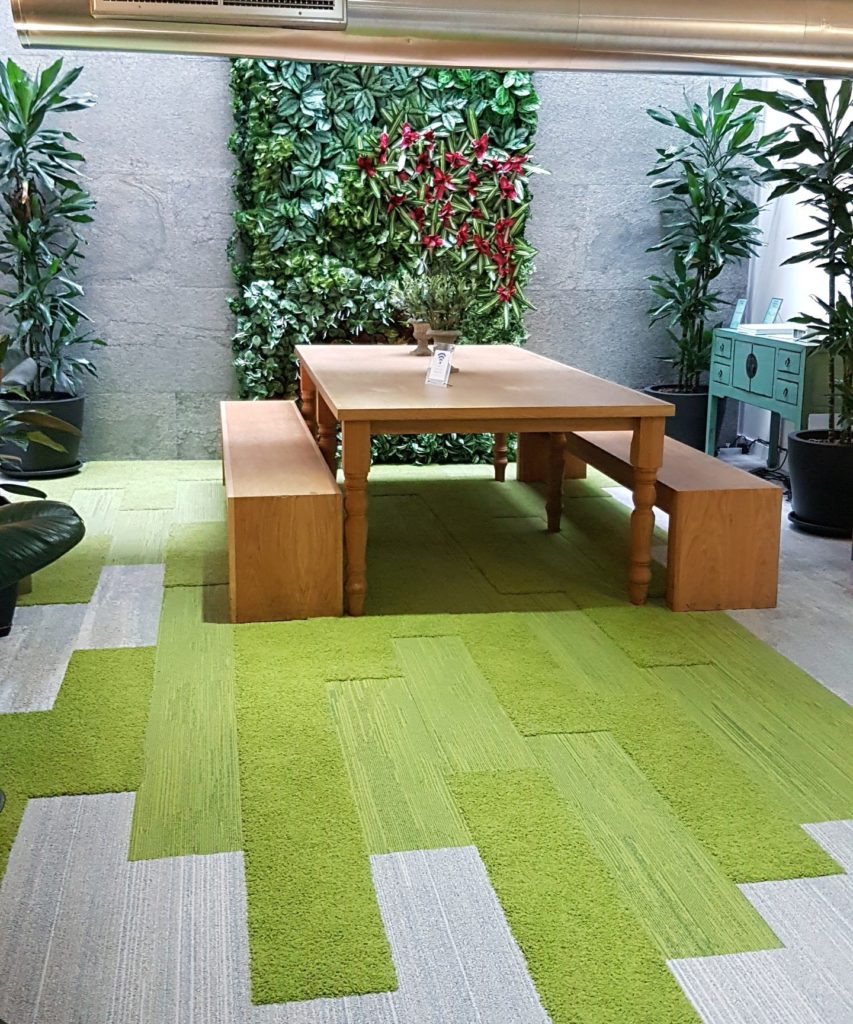
But remember, there is more than just one kind of green. Leaning towards a green that is too dark can create a much more sombre or even depressing mood, while one that’s too bright might cause headaches – literally.
Of course, there are many other colours derived from the three primary colours listed here. And we may delve into more secondary colours at a later stage. But these are the most common “go-to” colours.
Colour combinations
Don’t write off colours that don’t immediately inspire a sense of inspiration, calm or happiness. Sometimes all you need is a dash of energy to brighten up a room and energise the minds in it. Simply accessorising or complementing with colour can have positive effects.
Grey, for example, is not considered a particularly exciting colour by most people. And maybe that’s because it isn’t actually a colour as such. It’s an often dull mix of black and white that has collected a few negative connotations over the centuries. One wouldn’t traditionally associate it with feelings of reckless abandon, excitement or creativity.
But when paired with other colours, grey can work wonders, as seen in the image below.
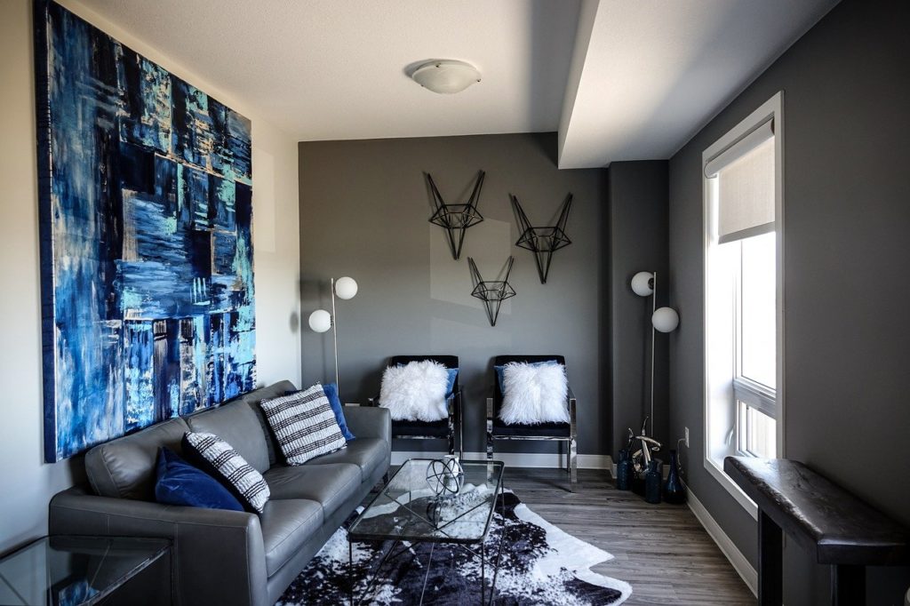
Even black (when used responsibly) can make a surprisingly effective style choice when decorating your office space, despite its traditionally ominous connotations.
When accented with colours that inspire productivity and energy, sometimes a slightly duller colour is perfect to set off the room, and even minimal colour can do the trick.
Add the right colour with Novex
Novex Solutions in Chertsey has been furnishing and decorating offices for 20 years. We’re a family of locals who understand the people we serve and have helped a number of businesses find just the right colours to make their spaces as productive as possible.
Call or email Novex Solutions to find out more about identifying the styles and colours that will make your office shine. And download our “Stress-Free Guide to Workplace Refurbishment” here, to get your imagination fired up.